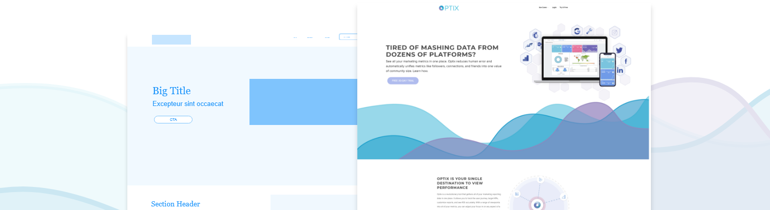
Tracking users’ interactions with your website can be an exhausting endeavor—even more so when compiling disparate data sources into a single report. Optix gives you easy access to at-a-glance user interaction and experience updates in real time. Learn how Optix improves UX/UI on websites.
User experience (UX) and user interface (UI) are closely intertwined. Both are vital to a website’s success.
Regardless of the company’s industry, statistics show that UX/UI is inescapably important for your corporate website. According to Intechnic, the return on investment for UX is an astounding 9,900 percent. Effective UI can increase conversion rates by up to 200 percent, and UX by up to 400 percent.1
Similarly, the cost of poorly designed UX/UI is steep: 70 percent of customers abandon purchases due to a lackluster user experience, and 91 percent of those who don’t complain will simply leave your website (and product) without a second glance. Thirteen percent of those non-complainers will go on to tell at least 15 more people about their negative experience.1
What’s a concerned digital marketer to do about UX/UI? Optix offers the solution.
Thankfully, there’s Optix: cutting-edge dashboard software that easily combines multiple data sources. That means easy access to at-a-glance updates in real time. In addition, Optix optionally enables client reporting through a white label reporting dashboard.
Optix is the ultimate digital marketing dashboard tool. Here are three reasons why using Optix will improve your UX/UI.
Optix Empowers User-Focused Research
What are your goals for your website’s users? Maybe you want them to complete a purchase or sign up for a free trial; maybe you want them to be drawn to your company newsletter.
Whatever the end goal is, Optix enables you to display data surrounding custom-made goals and specific strings of behavior.
For instance, if you want to know which users of your website both made a purchase and signed up for notifications, Optix can track that doubly specific inquiry in a single chart on your dashboard.
According to Aptude, user-focused research like this is critical for UX/UI success.2 That’s especially true if you’re A/B testing different landing pages for certain user actions.
Optix Lets You Listen To Your Users
Forbes writes, “Reviews are an excellent source of user experience research. Users often write reviews to tell companies about bugs and usability issues, which will give you an idea of which performance factors are the most important to your users.”3
Nevertheless, many users will be disinterested in manually answering a survey or reviewing your website. If (as said before) over 90 percent of non-complainers simply leave your website, never to return, then you need easy, readable access to user behavior tracking—whether or not those users manually submit feedback.
Optix allows you to track your visitors’ drill path through your website without requiring any input from the visitors themselves.
These insightful dashboards are especially ideal for Google SMB companies, which may have fewer total users and need all data available about those users’ behavior.
If a digital reporting dashboard sounds like a lot of work to build, Optix has that covered, too. The program offers a broad selection of dashboard templates. Dashboard management has never been easier; neither have progress reports. Optionally, Optix can also function as a white label reporting tool.
Optix Ensures Your Communication Is Consistent
One essential principle of UX/UI design is consistency.4 If the first three pages your users visit have a “Subscribe” button at the bottom, for instance, then placing the button at the top instead on the fourth page would prove disorienting to the user.
Given the complexity of webpage elements, it can be difficult for digital marketers to recognize where a minor inconsistency might cause major differences in user behavior. By combining multiple data sources into Optix’s dashboards, you can easily spot where user behavior diverges from the intended or predicted pattern.
Optix also allows you to change a chart’s date range with a straightforward drop-down menu. If you want a marketing dashboard that compares KPIs before and after a UX/UI update, for example, it’s as simple as a single click.
By increasing the availability and accessibility of user data altogether, Optix empowers digital marketers to create websites that not only meet but exceed their goals.
To learn more about how Optix combines multiple data sources into visually accessible, customizable dashboards, visit www.optix.ai.
Additional Sources:
- https://www.intechnic.com/blog/100-ux-statistics-every-user-experience-professional-needs-to-know/
- https://aptude.com/technical-insights-blog/entry/ux-ui-design-fails-and-design-best-practices/
- https://www.forbes.com/sites/forbestechcouncil/2019/08/26/13-handy-uiux-tips-for-new-app-designers/#78e3b62c5bb5
- https://www.nickkolenda.com/user-experience/#ux-strategy41