Optix’s dashboards are ideal for both large corporations and smaller Google SMB companies, combining multiple data sources without becoming overwhelming. Read this blog to discover 4 ways that Optix offers the ideal customizable analytics experience for optimizing marketing campaigns.
Online activity occurs in a constant, stunning rush. Every minute on the Internet encompasses over 3 million search engine queries, over a million Facebook logins, over 33 million emails clicked, and over 800 million dollars spent on ecommerce websites.
Given the perpetual flow of incoming data, marketers have two key problems. First, they need to track information from a vast number of sources; and second, they need to distill that information into a comprehensible format.
As the best digital marketing dashboard tool on the market, Optix tackles both of these issues head-on.
Integrations
Without a formal analytics tool, social media and website reporting is incredibly time-consuming, requiring manual entries into a spreadsheet that will require updates again soon.
With Optix, however, you only have to link your preferred platforms once. Integrations in Optix are as simple as providing your login credentials to the data source you want to access; then the data you want will update on your dashboard in real time. You can even change the date range being tracked with a single click!
Available integrations in Optix include social media (Facebook, Twitter, LinkedIn), Google Analytics (for all of your business websites), email blast services (iContact, Mailchimp), Google Ads, Formstack, and more. In addition, the Optix team is adding new integrations all the time (Constant Contact coming soon!).
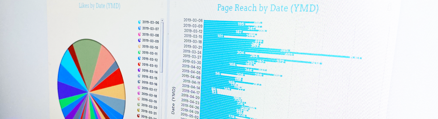
Chart Types
Once you’ve selected your integrations, you can choose from a variety of available chart types. There’s a broad number of ways to visually portray your data. Examples include:
- Headlines (standard, trend, or multi-tab trend)
- Pie or donut charts
- Bar graphs (vertical, horizontal, or overlapped)
- Funnel or pipeline charts
- Tables (raw or grouped)
Many charts can even accommodate multiple sources—the multi-tab headline, for example—enabling you to access and compare data from all of your social media platforms or email blasts in one clear, comprehensive visual.
Templates
If you’re intimidated by completely customizing your first Optix dashboard, have no fear. There’s a myriad of templates to help you get started.
All you have to do is select an integration as the dashboard’s focus. Then Optix will take you directly to a list of available, relevant templates. If you were building a board based on Google Analytics, for instance, your options would range from “Email Traffic Overview” to “Ecommerce” to “Social and Web Performance.”
As you become more comfortable with Optix, even dashboards that started as templates remain fully customizable—so you can ease into using the tool and maintain full control simultaneously.
Visual Customization
Fourth and finally, Optix features multiple avenues for visual customization. Once you’ve chosen your sources, charts, or even a template, you can truly make every dashboard your own with themes, color pallets, fonts, background images, and more.
You can even convert your dashboard directly into a client reporting layout—complete with optional white label options that maximize your branding’s impact.
Try Optix Today
If these features sound appealing, Optix is currently offering a free trial, which grants temporary access to every feature included in a standard subscription. There’s never been a better time to take your dashboard reporting to the next level.
To learn more about Optix’s customizable analytics, visit optix.ai.